
Oncology Patient Enrollment Network Portal
OPEN Group User Guide
September 15, 2009
Logging into the OPEN Application
Login through the CTSU Members Web site
Viewing the Administrator’s Menu Bar
Edit Check Standard Expressions
Figure 2: Welcome Screen -- (Basic User)
Figure 3: Welcome Screen – (Administrator)
Figure 4: Forms Setup - Sub-Tabs
Figure 5: Selected Form Highlighted
Figure 9: Configuration Screen
Figure 10: Questions Screen Continued
Figure 11: Checklist Form when Notes and Tooltip options are entered
Figure 12: Date Field and Icon
Figure 13: Date Configuration Screen
Figure 15: Date Configuration Review
Figure 16: Widget Example - Radio Group
Figure 17: Widget Example - Check Boxes
Figure 18: Widget Example - Edit Boxes
Figure 19: Widget Example - Text Area
Figure 20: Widget Example - Drop Down
Figure 21: Widget Example - Calendar Date Option
Figure 24: List of Edit Checks
Figure 25: Configuring an Edit Check
Figure 26: Viewing an Edit Check
Figure 28: New Edit Check Screen #1
Figure 29: Associate Questions
Figure 30: Edit Check Confirmation
Figure 33: Resubmit a Registration
Figure 34: Old Registration Resubmission Warning
Figure 35: Successful Resubmit
Figure 36: Manual Registration
Figure 37: Manual Registration screen
Figure 39: Cancel Enrollment button on the Summary screen
Figure 41: Cancellation Acknowledgement
Figure 43: Override Status Screen
This OPEN portal application system will:
Enable an individual with administrator rights to perform any and all of the tasks that are assigned to patient registrars, on a given clinical trial, in addition to which the administrator will:
Be able to perform the various administrative tasks associated with maintaining a website;
Be able to change the visual appearance and the layout of the protocol forms, and
Be empowered to test and modify the validation rules (edit checks) for these protocol forms.
The OPEN Portal application is used to register patients on any study on the CTSU menu that chooses to include it as a registration option.
|
Minimum System Requirements |
|
|
Computer/Processor |
Computer with a 233MHz processor or higher (Pentium processor recommended) |
|
Operating System |
Windows XP, Windows Vista |
|
Memory |
128 MB of RAM minimum |
|
Display |
Super VGA (1024 x 768) or higher-resolution monitor with 256 colors
|
|
Application |
URL |
|
OPEN Portal |
https://open.ctsu.org/open |
|
CTSU members’ website |
http://members.ctsu.org |
The OPEN Portal business process is shown in the following diagram:
There are two ways to access the OPEN Application, by using the OPEN URL or by going through the CTSU Members’ web site. Both methods are described below.
To log into the OPEN Portal application you will need to:
1. Launch a new Internet Explorer window
2. Type in the URL for OPEN Portal located in the URLs section shown above.
3. The Log-in screen will be displayed and the User ID and password is requested (Figure 1).

Figure 1: Log On Screen
4. Enter your IAM username in the IAM User field and your associated password in the password field (these are the same username and password credentials you use to enter the CTSU members’ web site).
5. Press the “Log on” button to enter the system
or
6. Press the “Reset” button to clear the entered fields.
The Log on button will validate the entered IAM ID and password and allow you to enter the OPEN portal application. The welcome screen will be displayed, as shown in (Figure 2) and (Figure 3).
If the IAM username and password entered is invalid, OPEN will return the message “Invalid username or password”. The user is able to re-enter the IAM username and password.
If you have additional problems logging in to the OPEN application please contact the CTSU Help desk for assistance at 1-888-823-5923.

Figure 2: Welcome Screen -- (Basic User)

Figure 3: Welcome Screen – (Administrator)
You are also given the means to log into the OPEN Portal application via the CTSU members’ web site.
1. Open a new Internet Explorer window
2. Log into the CTSU members web site (see the URLs section)
3. Go to and click on the tab labeled “OPEN”. This tab will display information specific to OPEN and provide a button to enter the OPEN application.
4. Press the “OPEN” button. The OPEN application will launch displaying the welcome tab as shown in Figure 2 and Figure 3.
In the Administrator’s menu bar, there is one additional tab, the Form Setup tab. The other tabs, Home, Enroll, History, Reports, RSS, and Help, function the same way in the Administrator’s module as they do for the Basic User. These six functions are explained in detail in the Site User Guide. In this manual you will learn about the new tab, and its respective sub-tabs, which are unique to the rights and operations of the Administrator. Click the Form Setup tab and the following sub-tabs are displayed (Figure 4):
· Forms List
· Summary
· Questions
· Layout
· Preview
· Edit Checks
· Audit Logs
· caDSR View
Figure 4: Forms Setup - Sub-Tabs
The Forms List sub-tab displays the list of protocol forms that are currently offered through the Oncology Patient Enrollment Network (OPEN). There are three statuses a form can be in active, inactive and retired.
· An active form is complete and ready for current use. This is the version that is currently being used to create registrations.
· An inactive form is in an unused state. This form has been created but never used to create a registration. This form may eventually be activated for future use or be deleted.
· A retired form has been used to create at least one registration, because of this the form cannot be inactivated it can only be retired. A retired form cannot be modified or deleted.
Select a specific form that you would like to work with as shown in Figure 5. You will then be forwarded to the summary screen.
Once a form is selected you will then be able to operate the other sub-tabs. The sub-tabs in the Form Setup screen will now relate only to the selected form.

Figure 5: Selected Form Highlighted
SUMMARY
When a form is selected from the Form List, the Summary screen opens displaying summary information about that particular form (Figure 6).
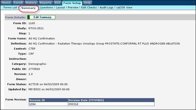
Figure 6: Summary screen
In this mode some of the details can be edited by clicking on the “Edit Summary” button. Clicking on the Edit Summary button will allow you to activate, inactivate or retire the selected form as shown in Figure 7. Activating an inactive form will automatically inactivate or retire the active form for the corresponding study/step combination.

Figure 7: Edit Summary
Click the Questions tab to configure the questions on the form. The attributes and requirements of each question associated with that form are specified in this page.

Figure 8: Questions screen
The following data is provided to the user such as:
· Que ID – The id of the question in the database
· Question name – The long name of the question
· Question Data type – The form the data entered will take
o Character
o Number
o Alphanumeric
o Date (see the “Formatting the Date Field” section for further details)
Using a Yes or No format, the user is able to specify whether the associated field will be:
· Mandatory (Reqd.)
· Editable (Edit)
· Hidden (Hide) or
· Uppercase (Upper)
The “Min.” and “Max.” columns are predetermined and are not editable by the user.
In the next field “# V. Values” you are able to determine whether to display the valid value’s long name, meaning or description.
· If the valid values count is greater than zero (0), OPEN will display this configuration  icon.
icon.
· Clicking that icon will display the configuration window for the associated data type. The configuration window shows all of the question’s valid values and their details.
· Change the display value by selecting the value’s name, meaning or description from the “Reset Display” drop down list. The selected value will be presented as the primary display on the checklist form.
· An optional display is also possible which will be shown within parenthesis. In addition to the value’s name, meaning or description, this drop down list also includes any associated instructions.

Figure 9: Configuration Screen
This is only for display purposes on the checklist form. When the value is saved in the database only the “Name” field will be associated with it.
The user is also able to specify:
· Any default value(s) that need to appear in the EC when the form is generated while registering a patient.
· The Widget Type of the field (Please see the Widget section for more details).
Notes can also be entered. As shown in Figure 10 entries in the notes field will accompany the associated field name on the registration form.
You will also be able to specify where the note will be positioned in respect to the associated field title. Using the drop down under the “Note Position” column the user will be able to specify whether the note will be on the top, bottom, to the left, or to the right of the field title.
Tooltip messages can also be added using this screen, also shown in Figure 10, the tooltip field will allow you to display any message that needs to be displayed when the mouse curser is pointing to that field name.
The Note, Note Position, and Tooltip columns can be expanded and collapsed by clicking on the +/- marks associated with the desired column.
The results of entering data in these fields are shown in Figure 11 below.

Figure 10: Questions Screen Continued

Figure 11: Checklist Form when Notes and Tooltip options are entered
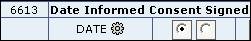
The date field can be configured to validate the user input by using the date validation screen. Click on the icon located next to the date you would like to configure.
Figure 12: Date Field and Icon
The date validation configuration screen is presented (Figure 13) and you can determine how that particular date field will function.

Figure 13: Date Configuration Screen
You are able to do multiple functions using this screen.
· You can specify that this date will only be valid if the date is in the past. You can do this by pressing the “Past Dates Only” button.
· You can specify that this date will only be valid if the date is in the future. You can do this by pressing the “Future Dates Only” button.
· You can specify specific date criteria by filling in the fields given.
o The “No. of Units” field will indicate how many units will be used in the calculation.
o The Units will indicate what time frame is being referred to. You have the option of choosing the time frame of days, months or years to validate against.
o The “Operator” field will indicate when the date criteria will be functional. You have the option of choosing a time period before “today’s” date or after “today’s” date.
o The date will always calculate from the current days date.
o You will also have the option of whether the current date is included in the calculation or not. In the “Include Today” field indicate whether the calculation will begin with the current date by selecting “YES” in the drop down menu, or indicate that the current date should not be included in the calculation by selecting “NO” in the drop down menu.
o You must enter an appropriate message in the “Message” field. The data entered in the message field will be what is shown to the user if an invalid date is entered in the associated date field.
For example, using Figure 13 we can see that this configuration says that the “Date Informed Consent Signed” date field will only be accepted if the date is ‘5 days before today, including today AND 10 days after today including today’. If this validation is not satisfied then the data you provided in the message field will be presented to the user for further action, as shown in Figure 14.
Figure 14: Error Message
Pressing the “Review” Button will show you what the valid user input dates will be according to your configurations, as shown in Figure 15.

Figure 15: Date Configuration Review
o Press “OK” to save the date configuration screen.
o Press “Clear” to delete changes.
o You must save the Questions screen to see the changes made in the associated form. You are able to test out the validations using the “Preview” screen.
The term widget is used to describe various visual components (graphical display elements) by which information is presented to the OPEN user. Some widgets have the capability to display significant amounts of data, such as paragraphs of text, while others are little more than “switches” that accept a Yes or a No answer to questions on a form. The following are some of the more common types of widgets used in the forms:
For a specific form question, two or more options may be displayed as possible choices, each has a small circle (radio button) by it. Clicking a circle with the cursor marks it, to indicate your choice (Figure 16). Only one button within a radio group can be selected. (Clicking a second button negates the first.) In this example, only one payment method can be selected.
|
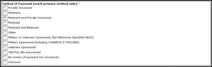
Figure 16: Widget Example - Radio Group
The simplest data entry item, a check box is often used to indicate the affirmation of a question, e.g.: “I am at least 18 years of age”. A small square box is placed beside the question. Clicking the cursor on it marks it with a check mark.
When a question can have more than one answer, a check box is placed beside each option. As many boxes may be checked as apply (Figure 17). This instruction is clearly marked on the form
|
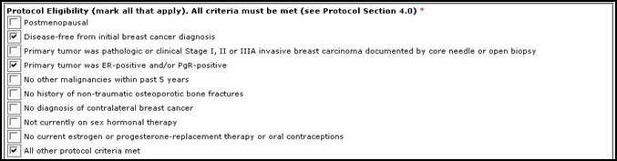
Figure 17: Widget Example - Check Boxes
An edit box is a small rectangle of varying length into which data can be entered. It is commonly used to enter initials, dates, names, addresses, etc. (Figure 18). Usually there are conditions or limitations programmed into these fields, i.e. the number and type of characters, the formatting of the field, etc.

Figure 18: Widget Example - Edit Boxes
A text area is an expanded edit box that is capable of holding many lines of data, limited only by the constraint of size that is programmed into the code (Figure 19). Comment and explanation boxes are the most commonly used text areas.
|
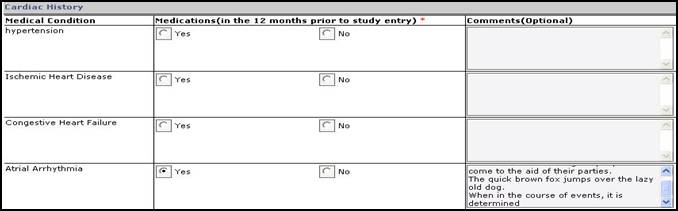
Figure 19: Widget Example - Text Area
Click the down arrow at the right side of an edit box and a list of possible answers opens. Click on your choice and it is displayed in the field. Only one selection is allowed. This type of drop-down widget is frequently used for lists of dates, (months, days, years), States, etc. (Figure 20).
|
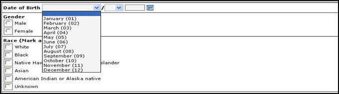
Figure 20: Widget Example - Drop Down
With date fields, there is an added icon, which when clicked displays a small calendar. When a specific date on the calendar is selected and clicked, the date auto-fills the accompanying edit fields (Figure 21). Clicking on the “Yesterday”, “Today”, and “Tomorrow” buttons will automatically populate those respective dates in the date field.

Figure 21: Widget Example - Calendar Date Option
Multiple choices are displayed in a fixed window. There may be a scroll bar you can use to display additional options that can be chosen. More than one choice can be selected from the list of values.
While the Questions module is concerned with what information is being collected and widget types deal with how the data is entered on the form, the Layout module determines where the data fields are located. You are able to enter in where the field will appear in the EC form.

Figure 22: Layout screen
Display Row Num – This column will dictate what row in the module the item will appear on. Using the picture in Figure 22 we see that the last, first and middle initials will all be on the first row; site name on the second row; treating physician on the third row etc.
Display Column Num – This column will dictate what column in the module this item will appear on. Using the picture in Figure 22 we see that the last initial is in column 1 and the first initial is in column 2 and the middle initial is in column 3. Site name will be in column 1 of row 2. etc.
Display Cell Column – The display cell column will dictate the stacking order of the questions within a cell that the items are located in. This is usually done when an item is grouped as one but have different values. For example, entering the month and year; the date field will be one item but the month will be in display cell 1 and the year will be in display cell 2 indicating that the month should proceed the year in the order it is displayed.
Figure 18b: Display Cell Column
Following this Layout as presented in Figure 22, the EC will be structured to look like this:

Figure 18c: Output of the Layout Screen
Select the Preview tab to get a view of how the form has been formatted according to the specifications you updated and saved in the Questions and Layout screens. Incremental modifications can be checked in this way.
1. Make changes in the Questions and/or Layout screens.
2. Save the changes on the respective screen.
3. Press the “Preview” tab to view the changes you have made to the form
4. Repeat these steps until the form is viewing as desired.

Figure 23: Preview screen
Edit checks allow you to specify additional validation conditions for the responses.
Select the Edit Checks tab to display the requirements and conditions that the input-data must meet in order for the registration to be successfully submitted to the Group.
The Edit Checks screen will show the:
· Type of edit
· Description of the scenario the system will check
· The expression that will be used to determine if the data entered is valid
· Whether the edit check is able to be overridden (a yes in this column will give the user the override option in the checklist form).
· Status of the edit check
· Failure type
· Failure Message (this is what will be displayed to the user if the data entered in the checklist form is deemed invalid).

Figure 24: List of Edit Checks
You are able to update an edit check by clicking on the  icon associated with the desired edit check. You are then able to update the edit check as desired. (See the “Creating a New Edit Check” section for details).

Figure 25: Configuring an Edit Check
To delete an unwanted edit check click on the trash icon  associated with that specific edit check. You will be asked to confirm the deletion. Pressing OK on this pop-up message will delete the edit check as desired.
You are also able to view edit check information by clicking on the  icon.
icon.

Figure 26: Viewing an Edit Check
Testing of an edit check is also possible. To test an edit check from this screen press the  icon associated with that specific edit check. You are then able to enter in test values to validate that the edit check will perform correctly. These tests will be logged in the Audit Logs screen.

Figure 27: Edit Check Test
The New Edit Check module provides the opportunity to create a specific error or alert condition.
1. Click the New Edit Check button.
2. The Define Expression screen displays the various fields that will be used for the edit check. (For an example of how the fields will look when completed please see Figure 25.)

Figure 28: New Edit Check Screen #1
3. When the fields are completed, click the Next button to go to Associate Questions screen (Figure 29). Using the drop-down menu in the Module column, select the specific Module that you wish to use in the edit check.
4. In the next drop down menu, make a selection under [Row #] Question (Figure 29). The drop down menu will be filtered to show only items that correspond to the Module selected in step 3.
5. Enter in the “Alias”, this will be the way the field will be identified in the checklist form. For example, the edit check statement might read “UPPER(:A2) = 'US' and (TRIM(:A1) is null or LENGTH(TRIM(:A1)) < 9)” - Here :A1 and :A2 are the Alias values.

Figure 29: Associate Questions
6. Finally, click on the Save button to confirm that the edit check record you have created has been executed and saved.

Figure 30: Edit Check Confirmation
7. Once you see the confirmation screen (Figure 30) you can click on the “test” button to test that the edit check works as expected.
Edit Check Standard Expressions
Standard expressions have been implemented which simplifies the writing of expressions required for edit checks. OPEN portal internally converts these standard expression to database valid SQL expressions. Additions to the standard expressions will be made as necessary. The standard expressions will always be in UPPER case letters. The following table gives the standard expressions that are available and the typical uses.
|
Standard Expression |
Description |
Example(s) |
|
TO_DATE_VALUE(:A1) :A1 is the date data collected in the EC form. |
This converts :A1 to a valid date. Recommended to be used always within OPEN for any data that is supposed to date. This takes care of many different formats such as yyyymmdd, mm/dd/yyyy,mm-dd-yyyy etc |
TO_DATE_VALUE(:A1) TO_DATE_VALUE(‘20080120’) TO_DATE_VALUE(‘12/23/2008’)
|
|
IS_NUMERIC_YN(:A1) :A1 is the numeric data collected in the EC form. |
This verifies whether :A1 is a NUMBER. Returns YES if :A1 does not contain any characters and special characters such as -, *,’ etc. Otherwise returns NO. |
IS_NUMERIC_YN(:A1) For :A1 is ‘1234’ , ‘-567’,’6’ it returns YES For :A1 is ‘AGhY’ , ‘ABCD’, ‘abcd’, ‘123F’ etc.. it returns NO |
|
IS_ALPHA_YN(:A1) :A1 is the character data collected in the EC form. |
This verifies whether :A1 is alpha. Returns YES if :A1 does not contain any special characters such as -, *,’ etc. and any numbers. Otherwise returns NO. |
IS_ALPHA_YN(:A1) For :A1 is ‘AGhY’ , ‘ABCD’, ‘abcd’ etc.. it returns YES For :A1 is ‘AG1Y’ , ‘-567’,’6’ it returns NO |
|
IS_ALPHANUMERIC_YN(:A1) |
This verifies whether :A1 is alphanumeric. Returns YES if :A1 does not contain any special characters such as -, *,’ etc. Otherwise returns NO |
IS_ALPHANUMERIC_YN(:A1) |
|
IS_FUTURE_DATE_YN(:A1, :A2) :A1 and :A2 are the date data collected in the EC form. |
This verifies whether the date :A1 is after :A2. :A2 is by default equal to today and is optional. Returns YES if :A1 is future date. Otherwise returns NO. |
IS_FUTURE_DATE_YN(:A1) – Verifies whether :A1 is after today IS_FUTURE_DATE_YN(:A1,’12092007’) – Verifies whether :A1 is after 12092007 IS_FUTURE_DATE_YN(:A1,:A2) – Verifies whether :A1 is after :A2 |
|
AGE (:A1, P_unit, :A2) :A1 and :A2 are the date data collected in the EC form.
|
The age calculated as the time difference between :A1 and :A2. The output will be in years if p_unit is YEAR and months if the p_unit is MONTH, and days if the p_unit is DAY. The :A2 is defaulted to sysdate and is optional. |
AGE(:A1, ‘YEAR’) – Age in years as of today from :A1. AGE(:A1,’MONTH’) – Age in months as of today AGE(:A1,’MONTH’,’09242006’) – Time difference in months between :a1 and ‘09242006’ AGE(:A1,’MONTH’,:A2’) – Time difference in months between :A1 and :A2 |
|
B42_CONCOMIT_MED(:A1, :A2, :A3) :A1 – Agent Name :A2 – Taking at the time of randomization? :A3 – Continuing after randomization |
This edit check is particular to NSABP-B-42, step 1 form, module - Concomitant Medications. It is a repeating question on the form. The errors for all the repeating questions are displayed at the same time. The error message specified in the edit check is over written by the messages from the procedure. The checks that this one does are Continuing after randomization can not be “No” when Taking at Randomization is “No”. Both, taking at randomization and continuing after randomization should be entered. Agent Name can not be blank when Taking at randomization is “Yes”. Agent Name can not be entered when taking at randomization is “No”. |
B42_CONCOMIT_MED(:A1, :A2, :A3) :A1 – Agent Name :A2 – Taking at the time of randomization? :A3 – Continuing after randomization |
|
:CREDIT_GROUP :STUDY :PATIENT_ID :STEP :INST_CTEP_ID :NOW - the current time :TODAY – current date
|
These edit checks are standard aliases within the expression that can be used for the “create new” screen variables.
|
:CREDIT_GROUP='SWOG' and upper(:A1)='NO' – verifies if a SWOG institution is present. :CREDIT_GROUP<>'SWOG' and upper(:A1)='YES' -
|
The following table gives the typical edit checks one would encounter and the suggested expressions.
|
Edit Check |
Suggested Expression(s) |
|
Patient initials must be letters |
IS_ALPHA(:A1)=’YES’ |
|
Patient birth year must be after certain year or before current date |
AGE(:A1,’DAYS’,’19450101’) <0 IS_FUTURE_DATE_YN(:A1) =’YES’ |
|
Patient has to be at least 18 years old |
AGE(:A1,”YEAR’) <18 |
|
Birthday can't be in the future |
IS_FUTURE_DATE_YN(:A1) =’YES’ |
|
SSN has to be 9 digits. |
LENGTH(:A1) < 9 |
|
Input a country when "other country" is selected. |
upper (:A1) <> 'OTHER' and (:A2) is not null |
|
Country of residence (other) should be entered only if "other is chosen for country of residence. |
UPPER(:A1) = 'OTHER' and LENGTH(:A2) is null |
|
The answer is yes, but the date is missing. |
:A1 =’YES’ AND :A2 is NULL |
|
Start date is present, but answer to question is "Yes" |
:A1 is NOT NULL and :A2=’YES’ |
|
Duration of time is missing, but answer to question is "Yes" |
:A1 is NULL and :A2=’YES’ |
|
Start date must be prior or equal to today's date. |
IS_FUTURE_DATE_YN(:A1)=’YES’ |
|
Date must be in the future. |
IS_FUTURE_DATE_YN(:A1)=’NO’ |
|
All questions must be answered. |
SELECT_ALL(:A1) |
|
Patient is not > or = 18 years of age. |
AGE(:A1,”YEAR’) <18 |
|
Date must be prior to or equal to today's date |
IS_FUTURE_DATE_YN(:A1)=’YES’ |
Audit Logs will be stored for all tests performed on the edit checks. You will have the ability to view all edit checks that were tested manually through the edit check screen and all edit checks tested directly from the checklist form.
To delete a test record click on the box in the ‘x’ column that corresponds to the test you would like deleted and press the “Update” button.

Figure 31: Audit Logs Screen
The Cancer Data Standard Repository (caDSR) screen will allow you to view the CDE information of a selected form. Opening the screen reveals a field with a drop down list of the possible forms (Figure 32). To see the CDE information of a form select the form name from the drop down list provided, and press the search button.

Figure 32: caDSR screen
The resubmit option gives you the means to resubmit a previously submitted registration.
When a registration is completed in OPEN the registration is then sent to the associated Group. If the Group system is not active or for some reason is not available to process the registration it will come back to OPEN in the status “Submitted”. The resubmit option gives you the means to resubmit the registration as necessary. Only registrations that are in “Submitted” status can be resubmitted

Figure 33: Resubmit a Registration
To resubmit a registration, select the “Submitted” registration from the In Progress screen and go to the checklist form or the “Review and Submit” tab. On the checklist form you will find the entered checklist for that registration and a “Resubmit” button (as shown in Figure 33).
Click on the Resubmit button.
If the registration is less than the current date, you will receive a warning message.

Figure 34: Old Registration Resubmission Warning
Click ‘OK’ on this pop-up to continue resubmitting the registration.
Review the registration and confirm the submission by pressing the “Resubmit” button on the review page
Click “Ok” on the confirmation pop-up
If the resubmit is successful you will be given a message indicating that the resubmit was successful and the Groups response.

Figure 35: Successful Resubmit
A Manual Registration can be performed if the registration for any reason was registered at the Group manually. For example, if OPEN is not available when an enrollment is to be done, the Groups can manually process the enrollment bypassing the OPEN portal. When OPEN becomes available the sites can use the Manual registration feature in OPEN to reconcile this registration so that the information in OPEN is in sync with the information in the Group’s system.
· Select the registration you want to manually register into OPEN from the In Progress screen, if the registration has already been initiated. If the registration has not been initiated you must go to the “Create New” screen and initiate the registration.
· Select the “Manual Registration” option from the summary screen.

Figure 36: Manual Registration
· Click the ‘OK’ option on the pop-up confirmation window.
· Enter the Patient ID and Treatment Arm provided by the Group. If the Checklist form(s) have not been completed, fill in the form. If they have been completed the associated data will display.
· Select the Validate and Register button.

Figure 37: Manual Registration screen
· A summary window will appear for your review. If all is acceptable press the “Register Manually” button. If changes need to be made select the “Checklist” button to make the changes.
· To change from the Manual registration mode to a Normal registration mode click on the “Normal Registration” button at the top of this screen.
Performing a data transfer can be done if it becomes necessary to resend the clinical data of an already registered patient back to the Group.
· Select the registration that you would like to send to the Group from the History screen.
· Press the “Data Transfer” button on the summary screen.
· Press the “OK” button on the confirmation pop-up box confirming the data transfer to the Group.
· You will receive a successful transfer message when the transfer is complete.

Figure 38: Data Transfer
1. Go to the History à Browser tab.
2. Select the registration that needs to be cancelled by pressing the associated select button.
3. The Summary page is presented.
4. Press the “Cancel Enrollment” button.
Figure 39: Cancel Enrollment button on the Summary screen
5. Press the “OK” button on the pop-up window to confirm the cancellation of this registration.
6. Insert cancellation comments as necessary (this is a required field) and press the “Cancel Enrollment” button.

Figure 40: Cancellation
7. Press the “OK” button on the second pop-up message to confirm the cancellation of the registration.
8. A verification page is presented to acknowledge the registration has been cancelled.

Figure 41: Cancellation Acknowledgement
Overrides to protocol requirements may be available on certain studies per Lead Organization guidelines. Administrators will be able to approve or deny overrides as needed. To approve or deny an override you will receive an email indicating an override has been requested.
1. Then go to the “Enroll” tab and select the “Overrides” option from the list of sub-tabs.
2. Locate the appropriate override and hit the “Edit” button associated with that override (Figure 42).

Figure 42: Override Screen
3. Select from the “Override Status” drop down list what status you will give this override
o Approved – the override is accepted the registration can proceed.
o Denied – the override request is denied the error must be corrected before the registration can proceed.
o On Hold – An override is pending or holding.
o Inactive – The edit check was inactivated after the override request and the override is no longer required. Resubmit the eligibility checklist.

Figure 43: Override Status Screen
4. Enter comments in the “Reviewer Comments” field. This field is mandatory and must be completed.
5. Click the “Save” button to submit.
6. You will receive a confirmation message indicating the override information was saved. The override requester will also receive an email indicating the override has been processed and what the status of the override is.

Figure 44: Confirmation